Knowledge Base Examples: What the Good Ones Have in Common
The best knowledge base examples share five traits. See each one in a live example, learn why it works, and score your own with a 12-point checklist.

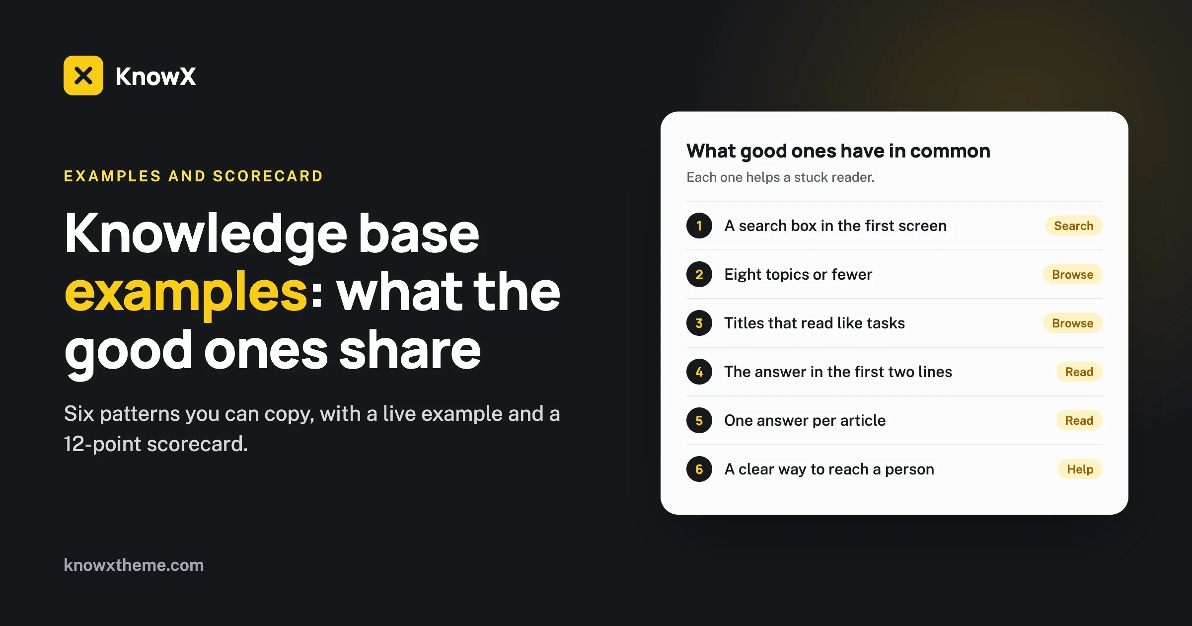
The best knowledge base examples share the same handful of traits: a search box you cannot miss, a short list of topics named in the reader’s words, article titles that read like tasks, one answer per article, and a clear way to reach a person. Design matters far less than these five things. This guide shows each trait with a worked example, explains why it works, and gives you a checklist to score your own knowledge base against.
We have not filled this page with screenshots of famous brands. Those go out of date within months, and copying a large company’s help center rarely suits a small team. Instead we use one sample help center, built on the free KnowX theme, so you can open it, click around and see every pattern working. Open the live example in a new tab and keep it beside this guide.
What makes a knowledge base example worth copying?
A good example is one where a stuck reader gets to the right answer in under a minute. That is the whole test. A page can win design awards and still fail it.
When you look at any knowledge base, yours or someone else’s, ask four questions in order:
- Can I search straight away? Is the search box in the first screen, and does it take plain words?
- Can I guess where my answer lives? Do the topic names match the words in my head?
- Does the article answer me before it explains itself? Is the fix in the first few lines?
- If I am still stuck, is the next step obvious? Can I reach a person without hunting?
Every pattern below serves one of those four questions. If a feature on someone’s help center does not serve any of them, you can safely leave it out of yours.
Example 1: What does a good knowledge base home page look like?
A good home page does three jobs in one screen: it offers search, it shows the topics, and it stays out of the way.
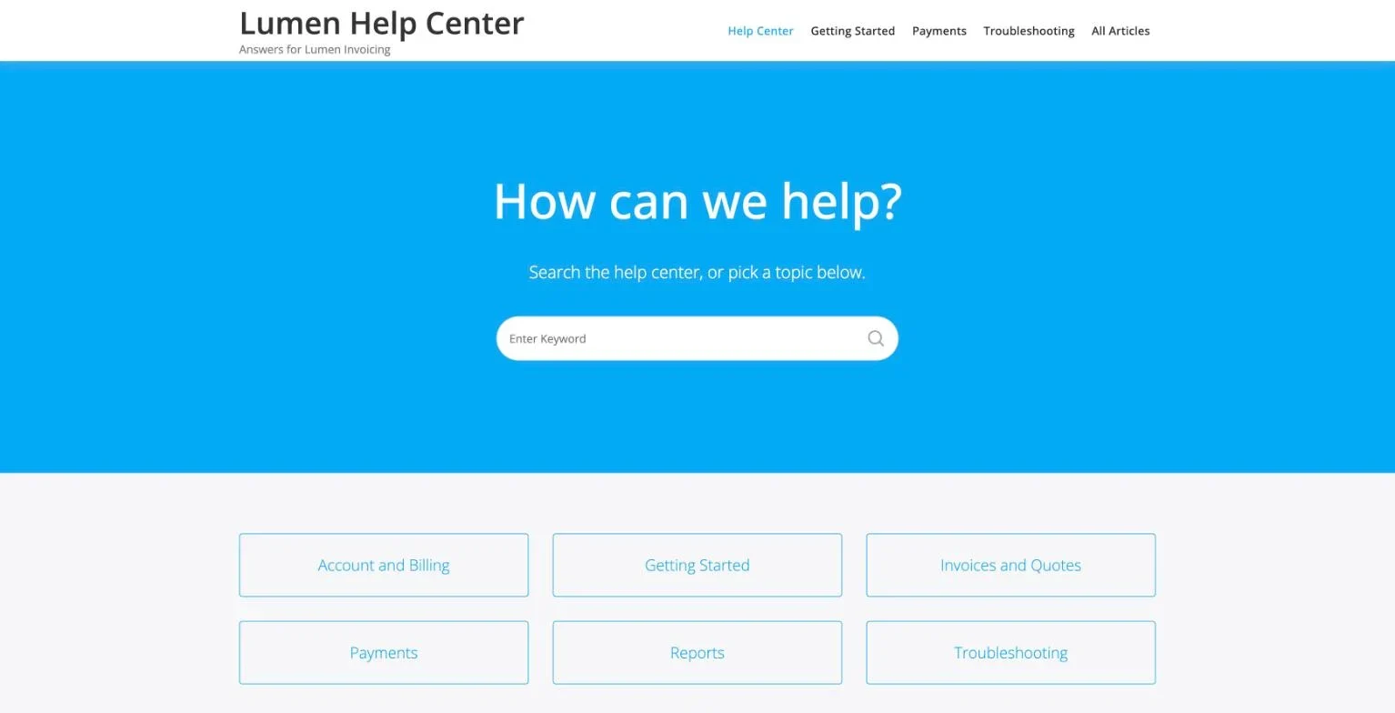
Look at what this page leaves out. There is no slider, no news, no product pitch and no welcome paragraph. A person arriving here has a problem. Everything on the page is a way to solve it.
Why the search box comes first
Most people who open a help center already know what they want to ask. A large search box in the first screen lets them ask it. The heading above it should be an invitation in plain words, such as “How can we help?”. A heading like “Knowledge Base” tells the reader the name of the page, which they did not need.
Why six tiles, not sixteen
People who do not search will scan. A person can scan six to eight short labels in a couple of seconds. Past that number they slow down, start reading every label, and many give up and write to support instead. If your product truly needs more topics, group them. Two levels of six is easier than one level of twenty.
How to check yours
- Open your home page on a phone. Is the search box visible without scrolling?
- Count your top-level topics. Are there eight or fewer?
- Read the first heading aloud. Does it sound like something a helpful person would say?
Example 2: How should topics be named?
Name topics after what the reader is trying to do, using the words they would type. The sample help center uses Getting Started, Invoices and Quotes, Payments, Account and Billing, Reports and Troubleshooting. A new customer can guess what is inside each one.
Compare two ways of naming the same six topics.
Named for the company | Named for the reader |
|---|---|
Onboarding Resources | Getting Started |
Document Management | Invoices and Quotes |
Financial Operations | Payments |
Subscription Administration | Account and Billing |
Analytics Suite | Reports |
Known Issues | Troubleshooting |
The left column is how a company describes itself in a planning meeting. The right column is how a customer describes their day. Good examples always use the right column.
The Troubleshooting topic
Almost every strong knowledge base has one topic for things that have gone wrong. People in a hurry look for it first. Without it, problems end up scattered across the feature topics, where a worried reader has to guess which feature is to blame.
How to check yours
- Show your topic list to someone outside the team for five seconds. Ask where they would look for “I was charged twice”. If they hesitate, rename.
- Search your support inbox for the words customers use. Do your topic names use the same ones?
We go further into this in our guide to structuring knowledge base categories.
Example 3: What does a good topic page look like?
A good topic page is a plain list of article titles, with the most-needed articles at the top. That is all it needs to be.
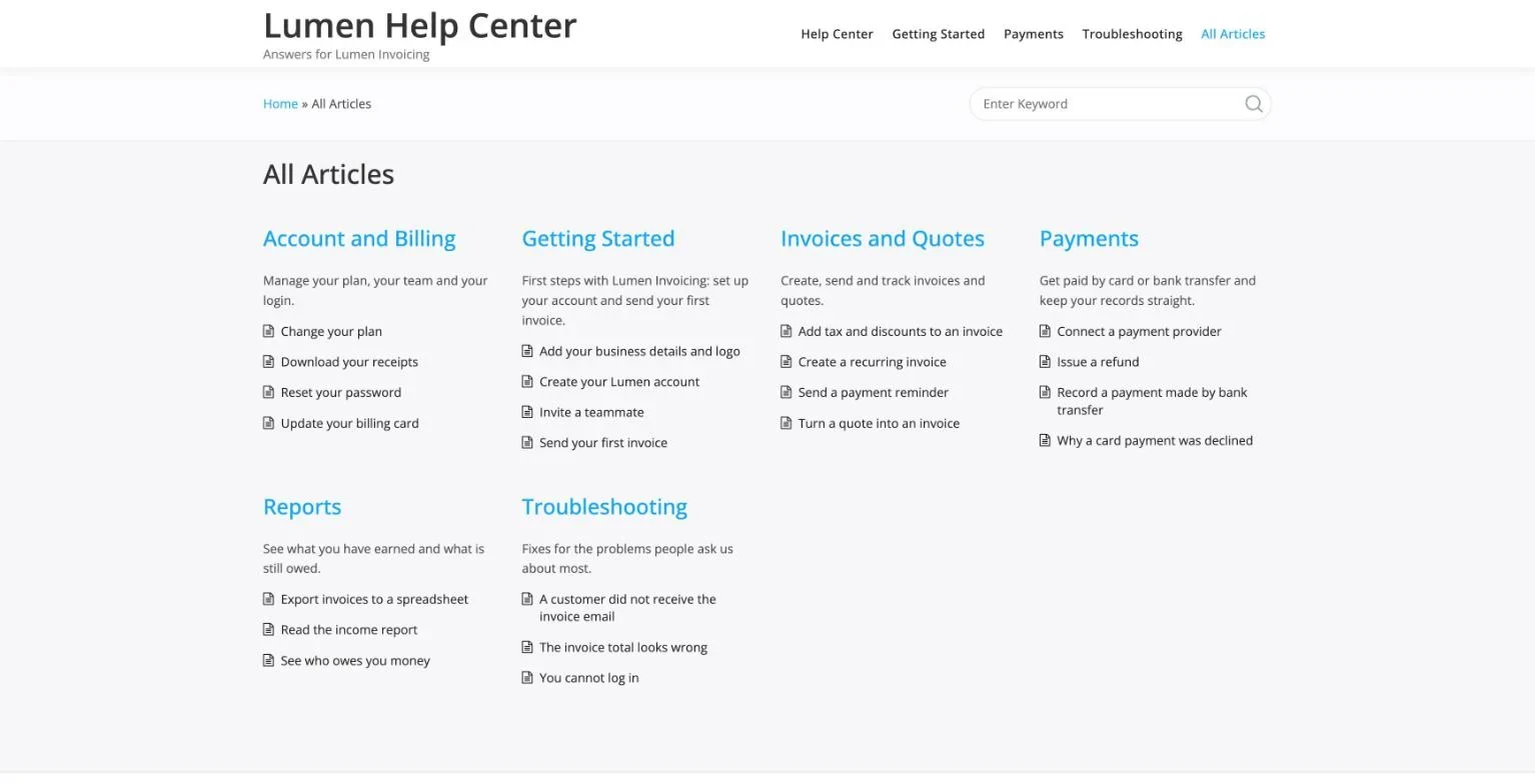
This layout puts every topic and its articles on a single page. It suits a small knowledge base very well, because a reader can see everything you have without clicking. Notice the one-line description under each topic. It confirms the reader is in the right place before they read the list.
Titles that read like tasks
Look at the article titles in the example: “Send your first invoice”, “Reset your password”, “Record a payment made by bank transfer”. Each one starts with a verb and names one job. A reader can tell from the title alone whether the article is for them.
Titles that fail this test usually look like one of these:
- A feature name: “Recurring Invoices”. Is this how to create one, change one or stop one?
- A vague label: “Payment information”. Whose, and what about it?
- An internal code: “INV-204 workflow”. Nobody outside the team knows what this is.
The exception: problem titles
In a Troubleshooting topic, title the article with the symptom the reader sees, in their words: “A customer did not receive the invoice email”, “The invoice total looks wrong”, “You cannot log in”. A person with a problem searches for the symptom. They do not yet know the cause, so a title built on the cause will not match.
How to check yours
- Read ten article titles in a row. Does each start with a verb or name a symptom?
- Could two of your titles be the same article? If so, merge them.
Example 4: What does a good article look like?
A good article gives the answer first, then the steps, then what to do if it did not work. It has the same shape as every other article in the knowledge base.
Here is the shape used in the sample help center:
- One or two lines that answer the question. A reader in a hurry stops here.
- Before you start. What the reader needs, such as being signed in as an admin.
- Steps. Numbered, one action each, with button names in bold.
- If it did not work. The usual cause and the next step.
The value is in the sameness. After two articles, a reader knows where the steps are and where the fallback is. They stop reading and start scanning, which is what you want from someone who is stuck.
One answer per article
The weakest articles try to cover a whole feature. They run to three screens, and the one sentence the reader needs is in the middle. The strongest examples split that feature into several short articles, each answering one question. Short articles are also easier to keep correct, because a product change usually touches one of them, not all.
Screenshots, used with care
A screenshot helps when a step is hard to describe: a small icon, a setting buried in a menu. It hurts when it is used for every step, because every product update makes a dozen images wrong. Good examples use one image where words fail, and none where words do the job.
How to check yours
- Open your five most-read articles. Is the answer in the first two lines of each?
- Do they all use the same headings in the same order?
- Is any article longer than two screens? What would it look like as two articles?
For a ready-made structure, use our knowledge base article template.
Example 5: How do good knowledge bases help people who are still stuck?
They end every path with a clear, friendly way to reach a person, and they say how long a reply takes.
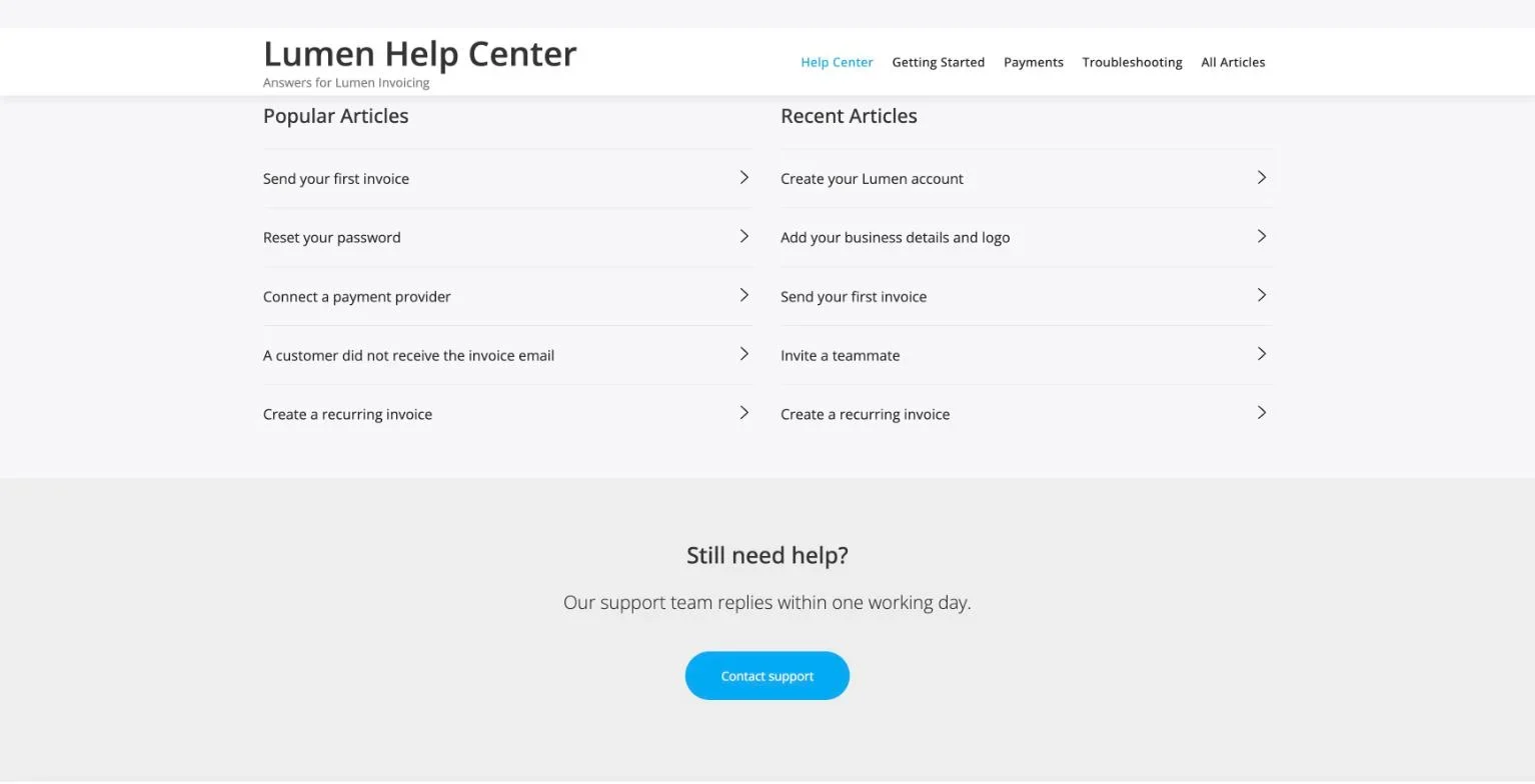
Some teams hide the contact link because they want fewer tickets. It does not work. A reader who cannot find the contact link does not stop needing help. They get angry, and then they find another route to you, usually a public one.
The better pattern is the one in the picture. The help center offers answers first, and when those run out it offers a person. The line under the heading sets an expectation: “Our support team replies within one working day.” A reader who knows when to expect a reply is far calmer than one who does not.
Popular and recent articles
The two lists above the support section do useful work. Popular Articles puts the answers most people need one click away. Recent Articles shows the knowledge base is alive. A help center whose newest article is two years old makes readers doubt every page.
How to check yours
- From any article, how many clicks is it to contact support? More than two is too many.
- Does the contact page say when to expect a reply?
- When was your newest article published?
Example 6: What does good navigation inside an article look like?
It shows the reader where they are and gives them one click back to the topic. Breadcrumbs do this in a single line: Home, then the topic, then the article.
Many readers land on an article from a search engine, not from your home page. They have never seen your topic list. Breadcrumbs tell them the article belongs to Payments, and that Payments has more articles if this one is not quite right. A search field next to the breadcrumbs lets them try different words without going back to the start.
A sidebar that lists the other topics does the same job for readers who prefer to browse. Keep it short. A sidebar with forty links is a second page to read.
How to check yours
- Open an article in a private browser window, as a stranger would. Can you tell which topic it belongs to?
- Can you search again without scrolling to the top?
What do weak knowledge base examples have in common?
The same few problems come up again and again. Each has a simple fix.
The home page that is really a marketing page
What you see: a banner about a new feature, a newsletter signup, and the search box somewhere below.
Check: cover everything on the first screen that is not search or topics. How much is left?
Fix: move it all to your main website. The help center has one job.
Prevent: agree as a team that nothing goes on the help center home page unless it helps a stuck reader.
Topics that mirror the org chart
What you see: topics named after teams or internal product names.
Check: would a customer in their first week know these words?
Fix: rename using the words from your support inbox.
Prevent: ask someone outside the team to review every new topic name.
The wall-of-text article
What you see: long paragraphs, no steps, the answer buried.
Check: can you find the fix in ten seconds?
Fix: move the answer to the top and turn the rest into numbered steps.
Prevent: give every writer the same template.
The stale knowledge base
What you see: screenshots of an old design, and steps that mention buttons that no longer exist.
Check: follow your three most-read articles step by step in the live product.
Fix: correct those three today. They carry most of your traffic.
Prevent: add “update the help article” to the checklist for every product change, and review the top twenty articles every quarter.
The empty shelf
What you see: a topic with one article, or none.
Check: count the articles per topic.
Fix: hide the topic until it has at least three articles, or fold it into a neighbour.
Prevent: create a topic only when you already have the articles for it.
How do the examples differ for an internal knowledge base?
The same five traits apply, with two changes in emphasis.
First, browsing matters more than search. Staff often do not know what to search for, because they do not know what exists. A page that lists every topic with its articles, like the second screenshot above, lets a new team member see the whole map on day one.
Second, the “reach a person” step becomes “who owns this”. Put the owner’s name or team at the bottom of each article, so a reader knows who to ask and who to tell when something is out of date.
There is more on this in our comparison of an internal wiki and a knowledge base, and on our internal knowledge base page.
How do you borrow from an example without copying it?
Copy the decisions, not the decoration. When you find a help center you like, it is tempting to match its colours, its icons and its layout. Those are the parts that matter least, and they are the parts that fit that company and not yours.
Use this method instead. It takes about twenty minutes per example.
- Arrive with a real question. Pick something a customer of that product might ask, and try to find the answer. Time yourself.
- Write down every choice you made. Did you search or browse? Which topic did you open? Was your first guess right?
- Note where you slowed down. A label you had to read twice, a page that made you scroll, a step you had to repeat.
- Note what helped. A title that matched your words, an answer in the first line, a related article that was the one you needed.
- Turn each note into a rule for your own knowledge base. “Titles start with a verb.” “No topic without three articles.” “Reply time on the contact page.”
After three examples you will have a short list of rules that came from watching yourself as a reader. That list is worth more than any template, because every rule on it solved a problem you felt.
Why small teams should not copy large ones
Large companies have help centers with hundreds of articles, several products and readers in many languages. Their home pages need product pickers, language switchers and layers of navigation. A team with thirty articles that copies this ends up with a maze around a very small garden. Match the structure to the amount of content you have today, and grow it when the content grows.
A scorecard you can use on any knowledge base
Give one point for each yes. Score your own, then score two others you admire, and compare.
Question | Serves |
|---|---|
Is search visible in the first screen on a phone? | Searching |
Is the first heading an invitation, not a label? | Searching |
Are there eight or fewer top-level topics? | Browsing |
Could a new customer guess what is inside each topic? | Browsing |
Is there a Troubleshooting topic? | Browsing |
Do article titles start with a verb or name a symptom? | Browsing |
Is the answer in the first two lines of each article? | Reading |
Do articles share one structure? | Reading |
Does each article cover one question? | Reading |
Do breadcrumbs show the topic on every article? | Reading |
Is contact two clicks or fewer from any article? | Getting help |
Does the contact step say when to expect a reply? | Getting help |
Ten or more is a strong knowledge base. Seven to nine is good, with clear work to do. Six or fewer usually means the home page or the article structure needs rethinking before you write anything new.
How do you build a knowledge base like these examples?
You do not need special software to get all five traits. You need a tool that gives you a search box, topics, articles and a contact step, and then you need to fill it with care.
The sample help center in this guide runs on WordPress with KnowX, our free knowledge base theme. Topics are WordPress categories and articles are normal posts, so anyone who has written a blog post can add an answer. KnowX gives you the two layouts shown above, breadcrumbs, a search bar and the support section.
To be fair about its limits: KnowX is a theme. It does not include article voting, search analytics, AI answers or ticketing. If you need those, you add a plugin or choose a hosted tool. Our page on WordPress as knowledge base software compares the two honestly.
If you want to try it, our step-by-step guide shows how to build a knowledge base on WordPress with KnowX.
Questions about knowledge base examples
How many articles does a good knowledge base need?
Fewer than you think. Fifteen to twenty clear answers to your most common questions will do more than two hundred thin ones. Start with the questions your inbox repeats.
Should a knowledge base have a blog-style feed?
No. A feed sorts by date, and readers do not care when an answer was written. They care which topic it is in. A short Recent Articles list is enough to show the knowledge base is maintained.
Should every article have a video?
No. Video is slow to scan and costly to update. Use it for the few tasks where seeing the motion matters, and always keep the written steps beside it.
Do good knowledge bases use categories or tags?
Categories for the main structure, because each article should live in one clear place. Tags can help search, but a reader should never need them to find an answer.
How often should you review a knowledge base?
Check the twenty most-read articles every quarter, and check any article the moment the feature it describes changes.
What should you do next?
Score your knowledge base with the table above. Pick the lowest-scoring area, searching, browsing, reading or getting help, and fix that one first. A better home page heading and clearer topic names take an hour and help every reader from that day on.
If you are starting from nothing, open the live example, see how it is put together, and see how teams use KnowX as a customer help center.